


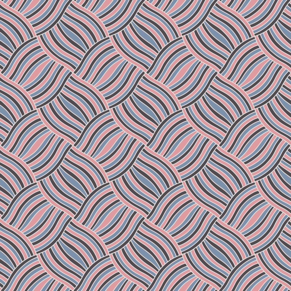
Our Basketweave wallpaper brings an energetic, 1970s revival spirit to the wall through an interlocking diagonal wave pattern created by Julia Dreams. The design draws on the visual character of a classic woven ribbon or basketry structure, rendered with screenprint-inspired graphic stripes in blush pink, dusty denim blue, charcoal, and warm cream. The rhythmic curvature of each band creates a lively sense of movement and visual depth, balancing playful retro geometry with a soft pastel palette. Like all Wallism wallpapers, this design is made-to-measure to your precise wall dimensions on PVC-free paper with a subtle physical structure.

Wallpaper - Basketweave
Available as
Premium
Our classic, go-anywhere premium paper
- Matte finish
- Paste application
- Easy to install
Popular choice €45/m²
Premium Textured
Our most luxurious paper with a slightly textured surface
- Textured matte finish
- Paste application
- Easy to install
Peel & Stick
Our premium self-adhesive paper with a matte finish
- Matte finish
- Self-adhesive
- Removable and easy to install
Always with Wallism
Won’t fade in sunlight
Non-glare
Eco-friendly and 100% PVC-free
Fire rated Class A
Non-woven material
Product info
Name
Basketweave
Design by
Julia Dreams
Type
Wallpaper
Wallism ID (MPN)
KWOaoK41M57d
More like this
Save
€39/
m²
Enter wallpaper dimensions
Width
cm
Height
cm
Add 7-10 cm of extra margin
 Made in Sweden
  30-day money-back guarantee
  Free shipping
  Ships within 2-5 days
 Wallpaper sample
€3 Printed on our premium wallpaper
  Sample shows pattern actual size Free shipping
  Delivery time 6-11 business days
 Loading ....
Loading..
How Wallism works

Choose your design
Pick a design from our collection of wallpaper murals.

Measure your wall
Measure your wall and enter the full width and height to see your price.
We produce and deliver
After a review, we produce your order and ship it within 2-5 days.
Loading ....
Loading..