Beyond the bestsellers: six wallpapers worth a closer look

Our five most ordered floral designs account for about 16% of the floral wallpaper items recorded in our latest year of orders. The rest are spread across more than a thousand designs.

That variety is something we are proud of. A familiar subject can offer very different drawing, colour and detail. These six designs sit outside the top five and each has something worth opening the image to see.

Purple Perplexed: for people who love the paint

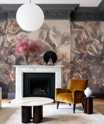
Purple Perplexed , by Jeanette Vertentes, pairs a dark background with magenta, violet and warm amber flowers. You can see the brushstrokes in the petals and leaves.

Choose it because you like that handling of paint. The marks remain an important part of the image even when you see it across a room. A single amber or plum detail can pick up a colour from the wall, leaving the painted flowers as the main floral element.

A Delicate Touch of Nature: the photographic alternative

A Delicate Touch of Nature , by Katarzyna Mrożewska, shows fine wildflower stems against a pale background.

Here, the attraction is in the small botanical details. If your saved flowers are mostly paintings, this is worth opening beside them. The photographed stems give you a different relationship with the subject, with less emphasis on the artist's brushwork.
A close view of the drawing may settle a choice that a bestseller list cannot. Fredrik Hallengren

Pumpkin Poppies I: warmth without a dark ground

Shirley Novak's Pumpkin Poppies I uses orange and yellow blooms against cream. The curving stems and seed pods are part of its character, too.

We like it as an option for someone drawn to warm colour who wants plenty of pale background to remain. Look at the whole design before deciding that orange flowers will make the room feel too orange. The cream between them changes the balance considerably.

Transcendent Peony, Cream: look at the petals

The large pale flowers in Transcendent Peony, Cream are defined through small changes in tone.

This is one to explore if you like the form of a flower more than a bright floral palette. Look closely at the layers of petals, then step back to see how they form the larger blooms. Keeping nearby colours close gives those gentle changes in tone room to remain visible.

Colorful Garden I: several colours to enjoy

Colorful Garden I , by Silvia Vassileva, brings together loose painted flowers in a varied palette.

You have several possible colours to take into the room, which is useful when you already own a colourful chair or favourite textile. Pick the connection that suits what you have. Trying to repeat every colour in the painting will make the room harder to pull together.

Fairy Tale Flowers V: a meadow with a different drawing

Silvia Vassileva's Fairy Tale Flowers V has a meadow-like arrangement of stylized blooms. Notice the shapes and the way the stems move through the composition.

Compare it with Colorful Garden I even if the lively colours first attract you to both. The artist is the same, but the flower shapes here are more defined. Open a detail of each and see which handling you prefer. A close view of the drawing may settle a choice that a bestseller list cannot.